Sunday, April 26, 2009
Question 3: Book Cover
I'm having a hard time designing the cover of my book. Because it will be made of rough handmade paper, I'll print the title and back description on a label. I'd also like the cover to include actual samples of some papers that are inside the book. Right now, the label and samples aren't working well together, probably because they are both squares that are similar sizes. Any ideas on what I can do? Should I abandon this idea?

Question 2: Glossary
Would a glossary be helpful for this book? Some things I would include are: hollander beater, mold, deckle, and watermark.
Question 1: Chapter Titles
As you can see in 3 spreads, there is a slight variation in the design of each chapter's title. My Story is underlined, Materials has a letter that's filled in, and Colour has a letter that's orange. I'm running out of ideas on what can be done with the other chapter's such as Marbling and Watermarks. Any suggestions? I want the differences to be fairly subtle so your attention isn't drawn to them, but obvious enough that you notice the differences.
Layouts
Reminder: the pages with 3/4 lines of type (the 3rd and 5th spreads) are strips of paper so the reader can feel the handmade paper behind the strip as they are reading the description. The pink sheet you see in the third spread would be the actual paper behind the description.


Saturday, April 25, 2009
More About The Design
Size: 9" by 7.5". It is large enough so the reader can get a good feel for the paper samples, and small enough to carry around.
Binding: Japanese stab binding. I chose this technique for 3 reasons:
1. I think this will add to the book's handmade feel.
2. A lot of handmade paper comes from Japan, so it makes sense.
3. Because I'm including paper samples, I need to bind single sheets.
Text font: Minion Pro 9pt with 14.5pt leading gives the book a fairly light colour.
Secondary fonts: Gill Sans 8pt will be used for captions.
Chapter titles: I'll be using a handwritten font called Angelina. There will be a slight variation in each of the titles. For example, in the chapter My Story, the word My will be underlined.
Descriptions of paper samples: The strip of paper will be about 2 inches wide and the text will be in Gill Sans.
Design
The design of my book will centre around the paper samples, with the information and colour corresponding to the samples in its chapter. I'd like a simple, clean look to offset the variety of textures and colours of the paper samples. Thus, the text will be in one column, with a generous outside margin for images and captions. Minion Pro will be used as the text font, with increased leading to create a fairly light colour throughout the book. The captions will be in Gill Sans and in a colour that relates to the chapter.
A unique aspect of the book will be the descriptions of the paper samples, which will be printed on small strips of paper. This is so the reader can read the information about the paper while seeing and feeling the sample at the same time.
The cover of the book will be made entirely of handmade paper. Small squares of different papers will be glued to the cover to represent my collection and the crafty, hands-on approach of the subject matter and the design of the book. Japanese stab binding will add to this handmade feel.
Tuesday, April 7, 2009
My Collection
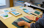
 Today I went to the Paper Place to add to my collection of handmade paper. The green sheet to the left is made in Winnipeg and contains a variety of perennial and annual flower seeds. If you place the paper under a thin layer of soil, you will see Snap Dragons, Coreopsis, and Poppies in no time! The other sheet is Orizome, or fold and dip dye and is a Japanese technique. The third is Brazilian hand marbled paper. The sheet of paper isn’t handmade but the marbling is done by hand.
I now have a variety of interesting handmade paper and will be finishing my research and starting on my layouts.


Subscribe to:
Comments (Atom)