Sunday, April 26, 2009
Question 1: Chapter Titles
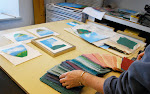
As you can see in 3 spreads, there is a slight variation in the design of each chapter's title. My Story is underlined, Materials has a letter that's filled in, and Colour has a letter that's orange. I'm running out of ideas on what can be done with the other chapter's such as Marbling and Watermarks. Any suggestions? I want the differences to be fairly subtle so your attention isn't drawn to them, but obvious enough that you notice the differences.
Subscribe to:
Post Comments (Atom)
In each chapter spread you have a different way of establishing the new topic. The slight variation in chapter titles is nice but I'm not sure it is necessary. I think the images you have chosen to resemble each new chapter are really strong and they are enough to draw your attention into the chapter. The chapter titles being different styles might be too much. Unless you were to change only the colour of the chapter titles, that way all chapters resemble each other and it is very subtle.
ReplyDeleteI agree with Tara. As nice as the variations can be, I think the images you selected are strong enough to indicate a chapter change.
ReplyDeleteI think if you are to continue with the variations, I suggest choosing one style (maybe the underline one but slightly longer to continue across the titles) OR eyedropping a colour from each photograph for the title.
Great work so far! :)
Hi Kari!
ReplyDeleteAfter looking at the three variations, I guess I just have to wonder what the significance of each change is. Maybe I'm missing something here, but I'm not sure I understand the connection between a filled in letter and 'Material', or an underline and 'My Story'. Not to say that these aren't good tactics for calling something out, I'm just not quite seeing the connection.
The only version that really made sense to me was the 'Colour' section having a different coloured letter... However, I think your chapter headings would be much stronger if you chose ONE style and kept it consistent throughout the book. For example, if you chose to go with the coloured letter (as in 'Colour') then maybe vary the colour for each heading rather than the entire style. I think you're making too much work for yourself trying to vary each title, while keeping them consistent. You've got some good ones there already, so maybe just choosing one and sticking to it is the best option...
Hope that helps!